Earth Genome’s Mikel Maron on the Importance of UX in Communicating Emissions Data

As part of an ongoing Climate TRACE series, we are interviewing individual coalition members about their work. We recently talked with Mikel Maron, Product Lead of Earth Genome, which leads the Climate TRACE user interface and platform development (aka the Climate TRACE website). On April 22 (Earth Day), Earth Genome won a 2025 Webby Award in the Sustainability & Environment category for the Climate TRACE site.
Earth Genome is unique among coalition members. Rather than modeling GHG emissions from a specific sector, you're responsible for making Climate TRACE's data accessible to the world via the website UI. What does that work entail?
Designing an interface for ClimateTRACE’s massive data set is a balancing act. There’s a healthy tension between executing good science — modeling and structuring reliable data — and communicating it effectively. That kind of applied science is both technical and an art, requiring precision and empathy for users ranging from policymakers to researchers to everyday citizens.
We start by aggregating collected data into a structured production database that powers both the API and website. From there, we handle interaction and visual design, deciding which features and data should be surfaced for users.
Our goal is to prioritize the most impactful use cases while making space for all kinds of users — including ones we haven’t even imagined. A big part of our work is figuring out how to make the data understandable and accessible for anyone, whether through downloads, APIs, or interactive tools.
To do this, we conduct user research, translate insights into design requirements, and experiment with visualization approaches. While the Explore map gets a lot of attention, we also build and maintain other tools to ensure the entire site supports both scientific accuracy and compelling communication.
You mentioned the importance of structuring data to support the end user experience. Can you say more about your approach?
Structuring the data effectively is key to supporting the many ways people want to query it. To make it web-ready, we optimize for speed, introduce redundancy, and pre-format it for fast access. Instead of computing queries on the fly, we pre-cache the views the front end will need. Feeding the front end directly from raw data would be far too slow to be usable.
While the front-end experience is built for ease of use and accessibility, the back-end ensures that data can be retrieved efficiently without slowing down the system, even as it scales. A lot of this relies on strategic pre-processing and setting up our database architecture for speed.
We also make sure the API is efficient and well-documented so external users can integrate the data seamlessly — whether they’re filtering by time slices, sectors, or other parameters. And for those who need offline analysis, we generate downloadable datasets, which takes significant computational processing.
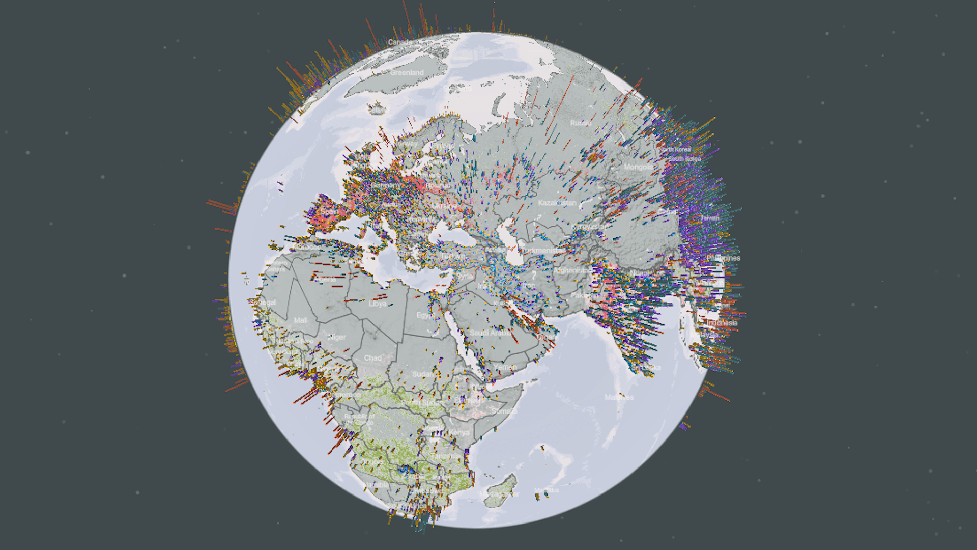
Let's talk a little more specifically about the global emissions map. How did you balance visual appeal with the seriousness of the data?
Color choices communicate a lot. A few years ago, we went through multiple iterations to find a palette that worked. The challenge was that we have many sectors, each needing its own distinct color, and far more categories than traditional cartographic best practices recommend. Our goal was to create a system where white points on the map were easily distinguishable while ensuring the colors conveyed the right message.
Beyond differentiation, we had to consider perception. Some early versions looked too soft, like cotton candy, which didn’t reflect the seriousness of the data. But we also didn’t want it to look overwhelmingly dark or alarming. There’s a balance we strive for at Climate TRACE, to present big data, seriously, while communicating a path forward. So we experimented with different palettes, including darker schemes and more intense colors like deep reds, which signal danger. We ultimately settled on a neutral palette that avoids extremes but maintains clarity.
One major update last release was lightening the background oceans. They’d been very dark to provide contrast, but that dominated the map and made it feel too heavy. The update improved clarity and aligned better with the broader site design. We also fine-tuned point scaling. Emission volumes vary by orders of magnitude, so we had to carefully set minimum and maximum sizes. Using a different transparency also helped, especially for oil and gas, where we wanted more visual emphasis.
That said, legibility at the global zoom level is still a challenge. At that scale, you’re not really analyzing data — it’s more about signaling that we have comprehensive coverage. We’re now considering a different design altogether for that zoomed-out view, one that conveys big-picture patterns and invites users to explore further.
You also handle UI for other Climate TRACE partners. Has that cross-collaboration offered insights into what matters most in tools like this?
Definitely. One relevant example is our work with RMI on WasteMAP, which visualizes emissions data from waste sites globally. It goes a step further with a decision-support tool that allows users to adjust landfill management strategies and see how emissions change over time. That experience has been invaluable for thinking about how to let users explore reduction pathways in Climate TRACE without overwhelming them.
Another useful reference is our collaboration with Global Energy Monitor. They needed a simple, lightweight tool without a backend. So we built a static, self-contained map — more modular and sector-specific than Climate TRACE’s comprehensive approach. This contrast between breadth and depth has given us a clearer view of what it means to build sector-specific tools versus comprehensive, all-in-one platforms, and how design needs to shift accordingly.
A big change for Climate TRACE this year is pivoting from annual to monthly data releases. That must have had big implications for the website's UI and UX. What has that planning been like?
It’s been a great challenge, both technically and visually. We had to rethink how to surface monthly data clearly, especially on the map. We explored letting users define custom date ranges, but most people just want to understand month-to-month trends quickly. So, while filtering is still annual, we’ve brought monthly charts front and center. Now, when you click into a source or a specific location, you can see emissions by month, something that wasn’t visible at a high level before.
One challenge is partial data: for example, if we’ve only released January 2025, it may look like emissions are lower than 2024, even though the year isn't complete. Rather than rescaling the map points and risking confusion, we’ve prioritized transparency, clearly labeling data like “January 2025” to show what’s available. Behind the scenes, we’ve done a lot of pre-aggregation to make sure monthly charts load quickly and stay responsive, even as the data grows.
A lot of emissions data has a reputation for being inaccessible in PDF files and spreadsheets. What do you think is the role of data visualization and the user interface in helping data tell a story and empower emissions reductions and climate action?
I'm excited about how the interface draws attention to the data so people can actually use it. Having emissions data is crucial, but there's extensive contextual analysis and visualization that has to happen to make it actionable. By setting a high standard for how we present the information, we help ensure it gets used — whether on its own or combined with other sources to solve a particular problem.
I hope our work inspires others to raise the bar for how climate data is applied, visualized, and presented. Al Gore pioneered showing this kind of data in impactful ways, and while we now have far more of it, it doesn't always get the attention it deserves. That’s why clarity and ease of understanding are so important. I’ve never met anyone, scientists included, who doesn’t appreciate visualizations that make complex data easier to digest. Unnecessary cognitive load slows people down and prevents them from getting where they need to go.
There’s a lot of research around how our brains process information, and digital products can tap into that to be more intuitive. That’s why we’re applying the same polish you’d see in a Fortune 500 ad campaign — because too often, the most important topics don’t get that level of investment, especially in science. But how information is presented really does shape how it’s understood and, ultimately, how it drives action.
Interviewed by Daisy Simmons.